Hearty
Redesign to Boost User Satisfaction
Background
Hearty is a free WeChat mini-program provided by the Deep Learning Lab at Westlake University, leveraging advanced AI to improve the efficiency and quality of the online mental health consultations. As an MVP, it required a refreshed design and enhanced user experience.
In May 2021, I joined the Lab as a part-time product designer to revamp the MVP, Hearty 1.0. Collaborating with the PM and developers, I contributed to the successful delivery of Hearty 2.0 within three months.
My Role:
Interaction Design, UX, UI, Animation Design, User Research (Survey & Interview)
Team:
1 PM, 1 PD, 2 Front-end Devs, 2 Back-end Devs
Duration:
May - Jul 2021
Tools:
Sketch, Axure, After Effects
Previous Design
Goals & Outcomes
Hearty 2.0, the redesign version, improved its users’ satisfaction by 38.7% from 3.1 to 4.3 out of 5, and gained positive user feedback for the new visual design, the adjusted information architecture, and the streamlined interaction experience.
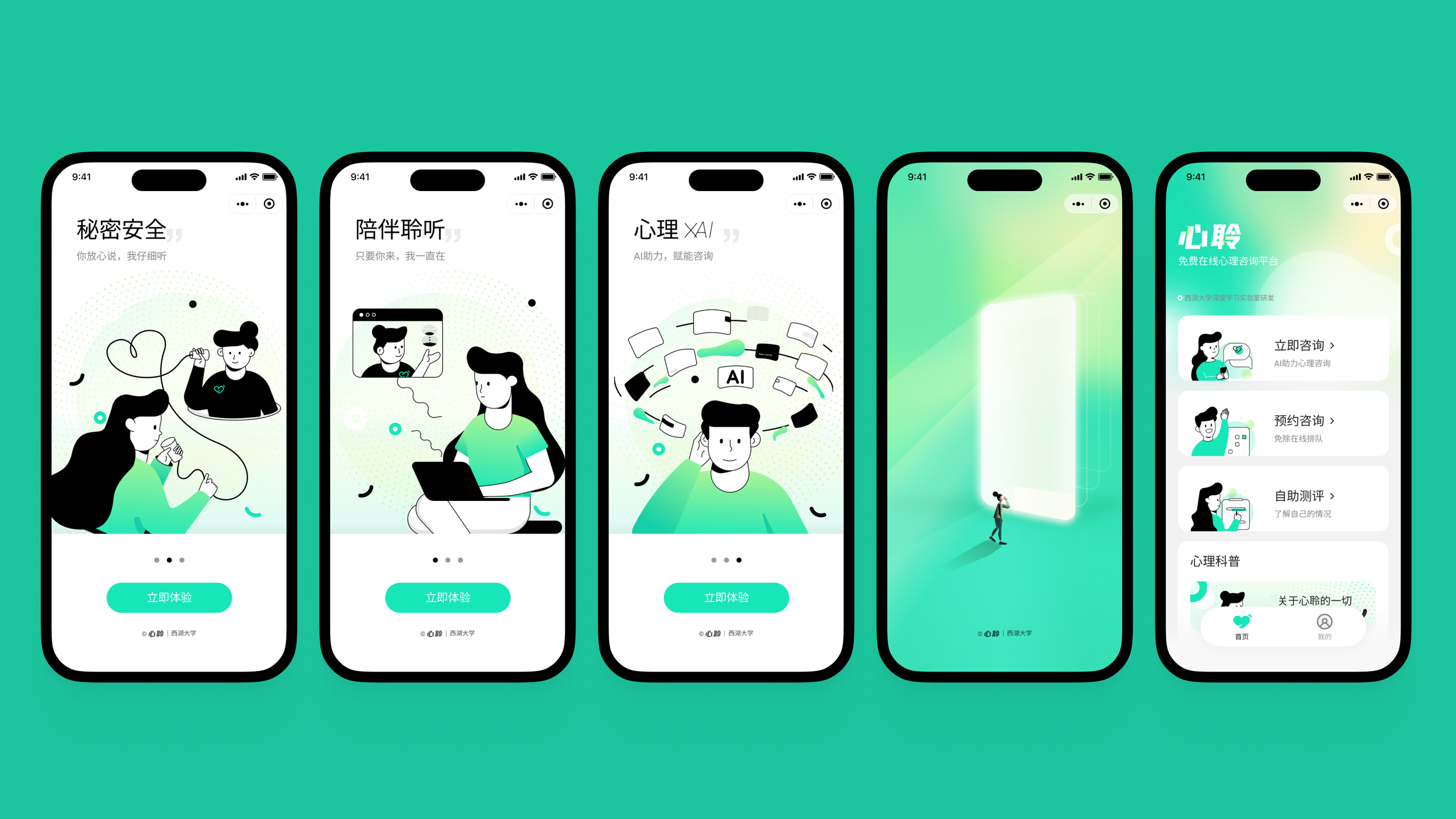
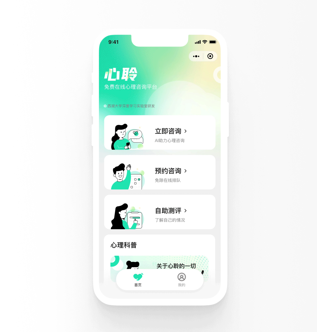
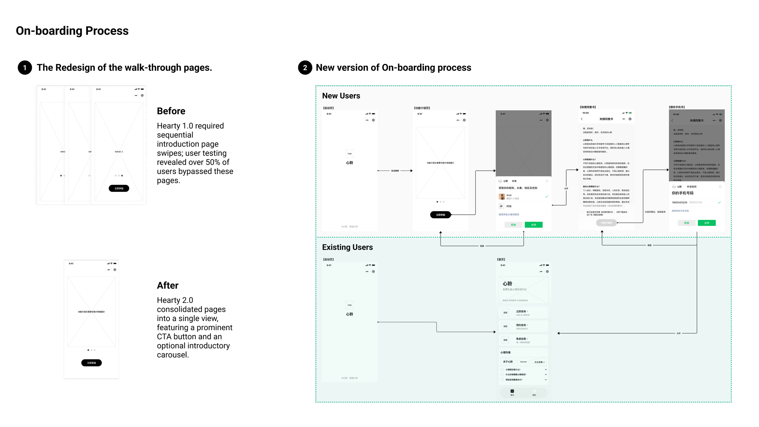
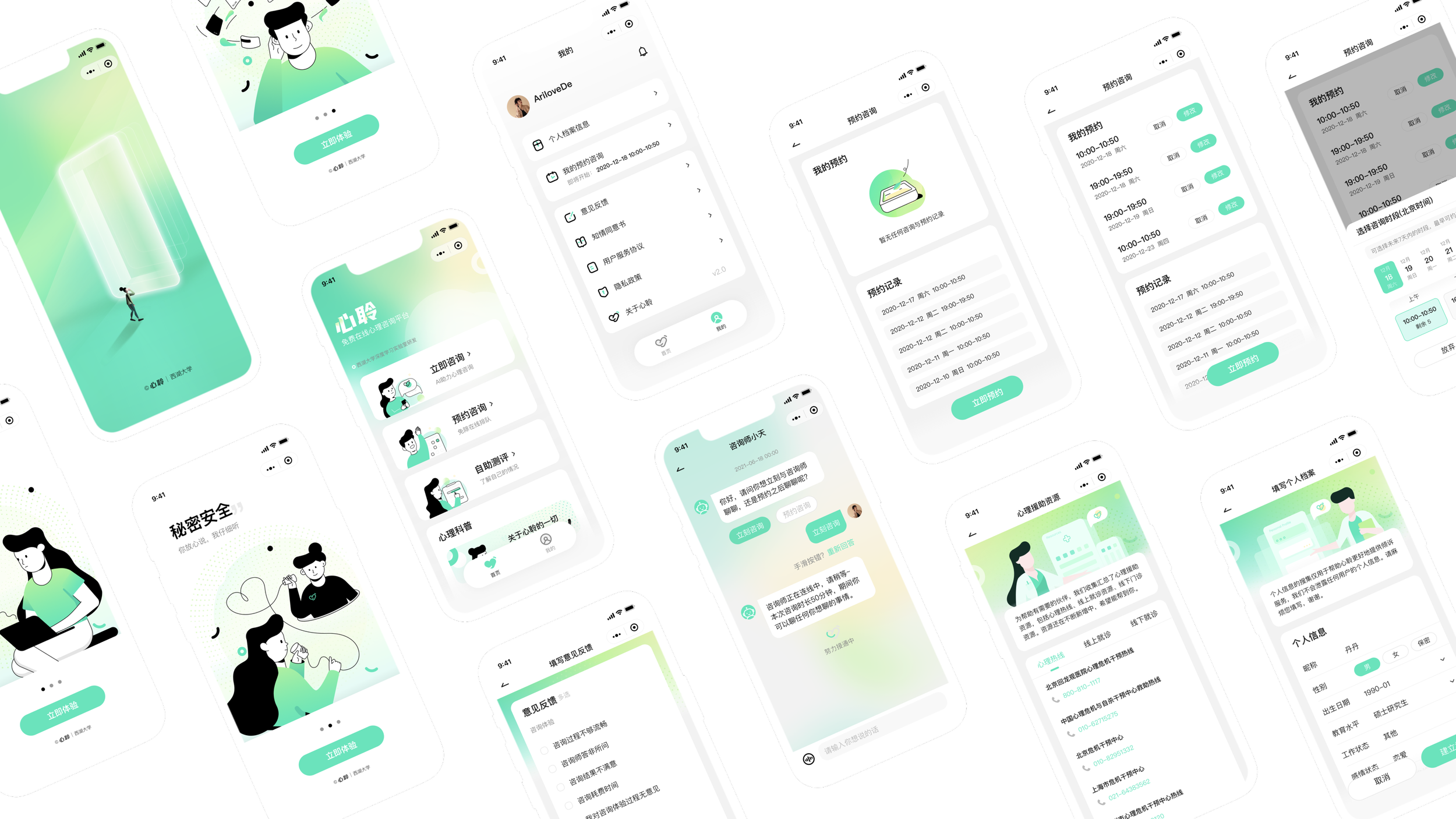
Onboarding Process
I streamlined Hearty 2.0’s onboarding by combining walkthrough pages into a carousel, adding a prominent Call-to-Action button, and redesigning the visuals to provide a pleasing experience.
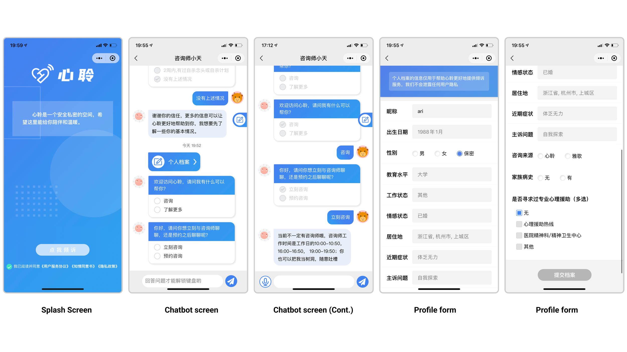
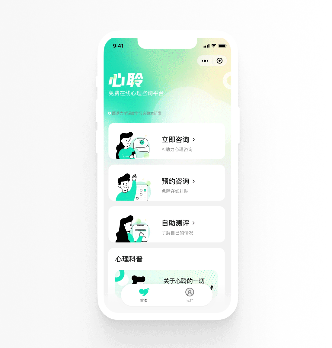
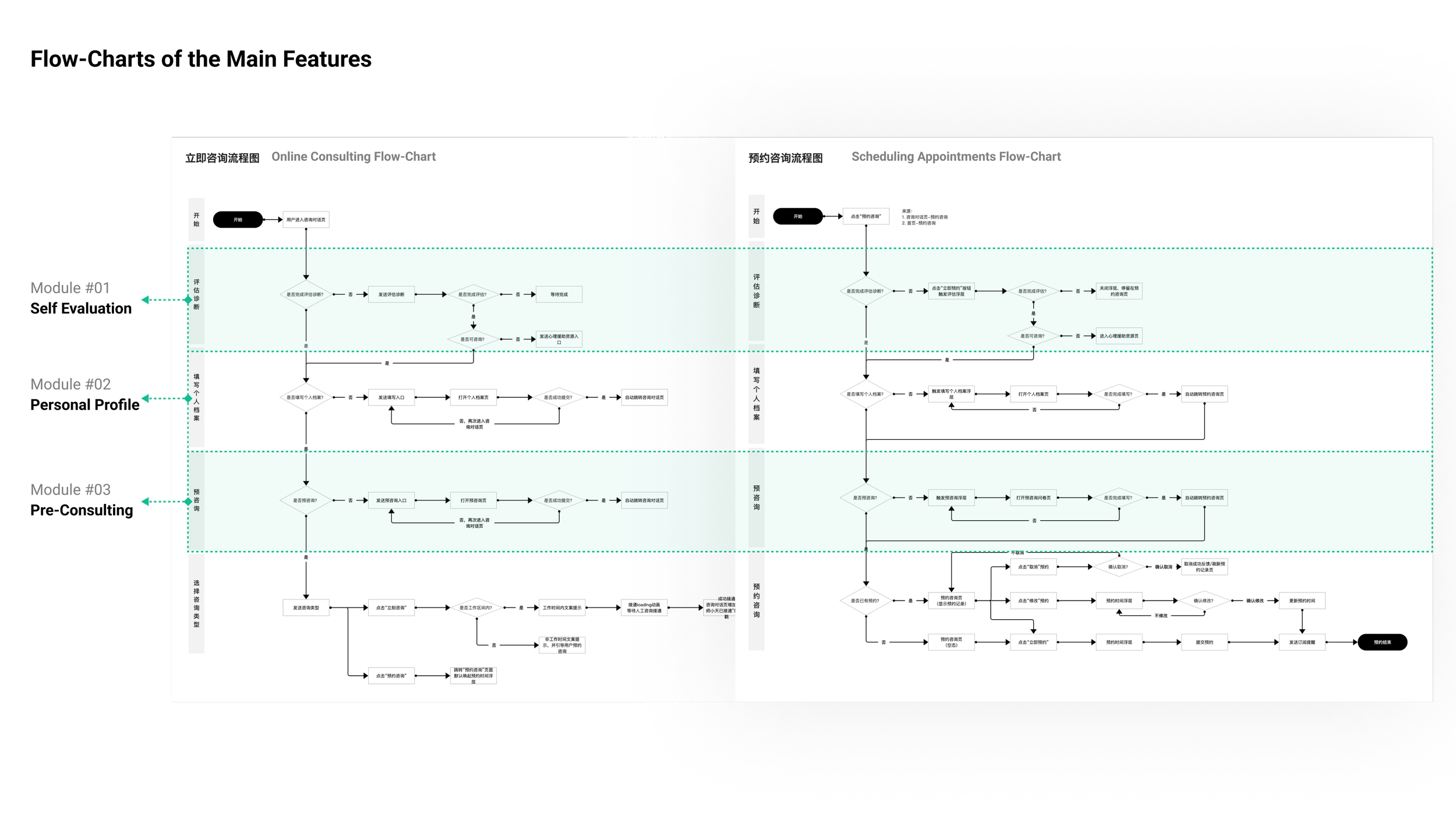
Online Consultation
Online mental health consultation is Hearty’s key feature, allowing users to instantly connect with a consultant through the Immediate Consulting button. I optimized Hearty 2.0’s information architecture by surfacing and organizing main features on the homepage for easy access.
Scheduling Appointments
Hearty allows users to schedule consultations, receive WeChat reminders, and manage appointments on the history page. I redesigned the Scheduling Appointments page for a more intuitive and seamless experience.
Research to Define The Problem Statement
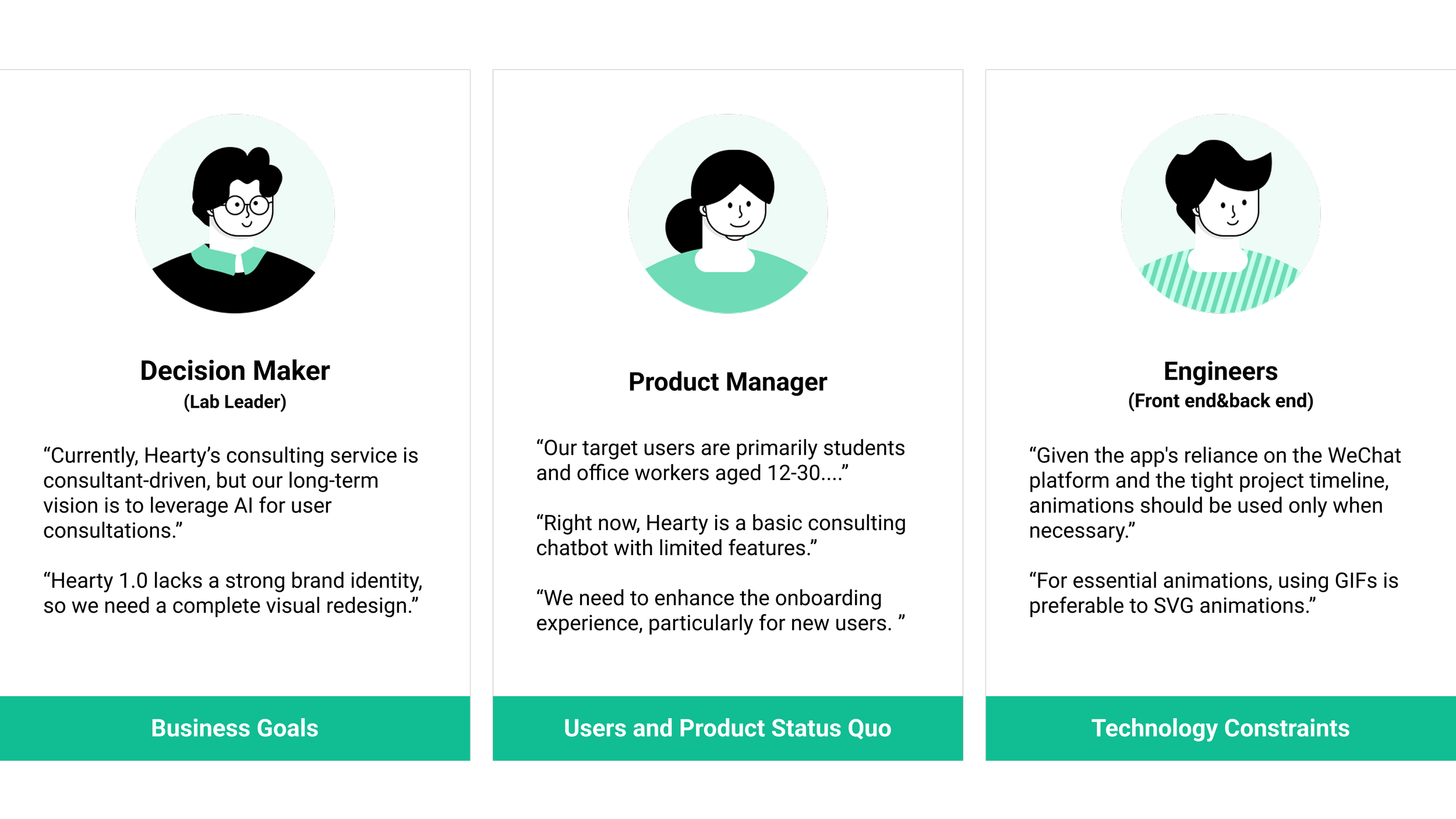
Interview Stakeholders
I learned Business Goals, Users’ Pain Points, Status Quo of Product, and Tech Constraints by familiarizing with the team and product and chatting with different stakeholders.
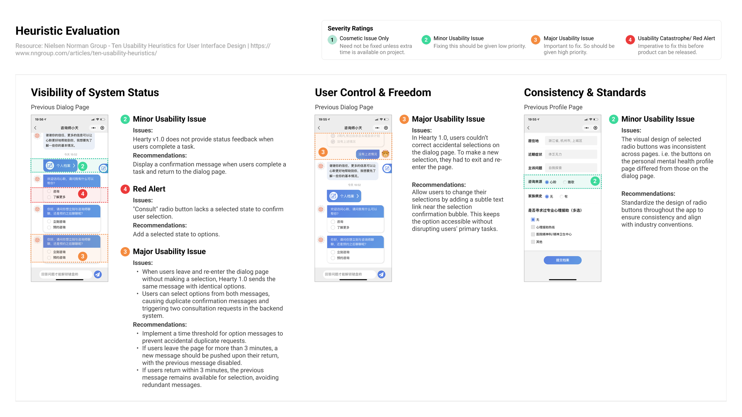
Audit Existing App
I identified several major heuristics violations of Hearty 1.0: User Control & Freedom, Consistency & Standard, and Visibility of System Status, by conducting a heuristic evaluation.
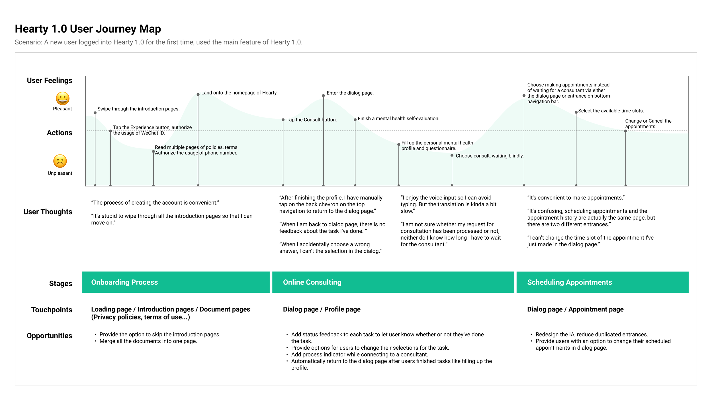
Conduct User Testings
I identified users’ pain points and prioritized the issues through user interviews with 6 users (three new users and three existing users). I found the barriers that users were facing in the three major features and created a user journey map of Hearty 1.0 based on the data collected from the interviews.
Define Problem Statements
The MVP’s user satisfaction ratings are low (3.1) because users’ experience of key features are not smooth, especially for new users during the onboarding and online consulting processes.
Explore New Design Solutions
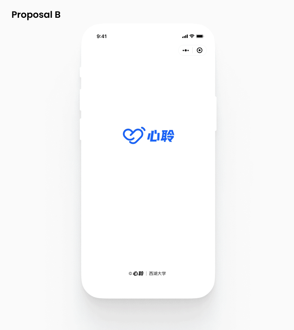
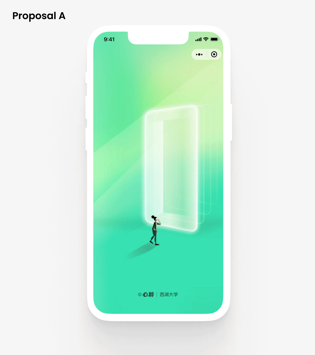
Develop Two Design Proposals
I collaborated with the PM to develop multiple drafts of Information Architecture for Hearty 2.0. I conducted several rounds of user testing (Card sorting) to nail down the IA with the most positive user feedback and the least re-developing efforts.
Then I ideated and explored different visual solutions and came up with two different proposals within one week, and pitched them to the team. The visual design of each proposal includes definition of the new brand color palette, icon style, illustration style, the radius of components, and layouts.
Use Survey to Collect Feedback
I created a poll on Hearty's official social media to gather users' preferences towards two proposals. 86.1% of the 361 voters chose version A (Green).
Draw User Flow Charts
To moving forward with the redesign work, I created flowcharts for Hearty 2.0 features, identified repetitive tasks, and proposed modularizing them for flexibility and to reduce future development efforts. The design team adopted my suggestion.
Use Wireframes to Evaluate Feasibility
I designed wireframes for each feature, reviewed and iterated them with coworkers and stakeholders, and conducted a technology evaluation with developers to address potential feasibility issues. Below is the onboarding wireframe.
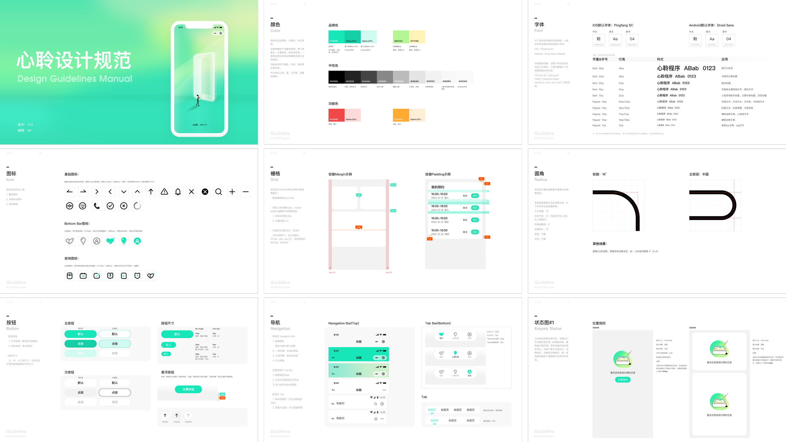
Create Hi-Fi Mockups & Define Guidelines
I applied the new brand visuals to Hearty 2.0 wireframes, created illustrations and icons for consistency, and developed design guidelines covering colors, typography, icons, and basic components to ensure uniformity and efficiency.
What I’ve Learned

Build Trustworthy With Users, Through:
Deliver professional mental health consultation services.
Respect and protect user privacy, such as only collect necessary personal data and securely store the consultation information.
Offer intuitive and consistent interactions across the app, ensuring users feel reliability and easy to get on.
Positionality Determines Product Direction
Hearty’s users recommended to have more mental health content. While the team recognized its potential priority, decisions were delayed for two reasons:
Viability and feasibility concerns, such as content types, generation methods, and financial constraints.
Ongoing debates about Hearty’s identity as either an Everything platform or a professional tool for mental health.